ブラウザやOSが違うとラジオボタンのデザインが違ってくるため、せっかく作成するなら統一したいと思うことがあると思います。
CSSだけでラジオボタンをカスタマイズできるのでカスタマイズをする方法のサンプルです。
カスタマイズ方法
今回は、以下のようにラジオボタンを大きく表示するサンプルレイアウトです。
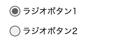
CodePenで実装をしたら以下のようになります。
See the Pen radio-css by take it easy (@take-it-easy) on CodePen.
HTML・CSSは以下のようになります。
HTML
<div class="radio-area1">
  <div class="item">
    <input type="radio" name="sample" value="1" id="sample-1" checked>
    <label for="sample-1" class="radio-label">ラジオボタン1</label>
  </div>
  <div class="item">
    <input type="radio" name="sample" value="2" id="sample-2">
    <label for="sample-2" class="radio-label">ラジオボタン2</label>
  </div>
</div>
チェック
ラジオボタンのラベルをクリックしてもラジオボタンが選択できるように、input[type=radio]タグのID属性と、labelタグのfor属性を合わせています。
CSS
div.item {
  margin: 15px;
}

div.radio-area1 input[type="radio"] {
  position: absolute;
  width: 1px;
  height: 1px;
  clip: rect(0 0 0 0);
  clip-path: inset(50%);
  margin: 0;
  overflow: hidden;
}

label.radio-label {
  padding-left: 30px;
  position: relative;
  cursor: pointer;
}

label.radio-label::before,
label.radio-label::after {
  content: "";
  display: block;
  position: absolute;
  /* 位置調整 */
  top: 50%;
  left: 0px;
  /* 中央に揃える */
  transform: translateY(-50%);
  /* 枠線 */
  border-radius: 50%;
}

label.radio-label::before {
  /* 背景色 */
  background-color: rgba(0,0,0, 0.06);
  /* 枠線 */
  border: 1.5px solid rgba(0,0,0, 0.6);
  /* サイズは調整 */
  height: 18px;
  width: 18px;
  /* 位置も調整 */
  left: 5px;
}

label.radio-label::after {
  /* 背景色 */
  background-color: rgba(0,0,0, 0.6);
  /* サイズ調整 */
  height: 12px;
  width: 12px;
  /* 位置調整 */
  left: 9.5px;
  /* 通常は表示しない */
  opacity: 0;
}

/* チェックがついた場合 */
div.radio-area1 input[type="radio"]:checked + label.radio-label::after {
  /* 表示する */
  opacity: 1;
}
ポイント
input[type=”radio”]は、ほぼ非表示にして、labelでトグルボタンを作成することがポイントです。
注意
- 色やサイズなどは自由に変更をして使用してください。
- 使用する場合は自己責任でよろしくお願いします。